
Color Confidence for Interchangeable Yoga Pieces
Today we dive into color palette strategies to coordinate interchangeable yoga pieces, showing how a thoughtful mix of neutrals, tonal shades, and strategic accents makes every top, legging, and layer snap together. Expect practical color theory, fitting-room tests, and confidence-boosting examples you can try this week. Share your favorite pairings below and subscribe for fresh mix-and-match inspiration that keeps your studio-to-street rotation endlessly versatile.
Build a Neutral Core That Anchors Every Outfit
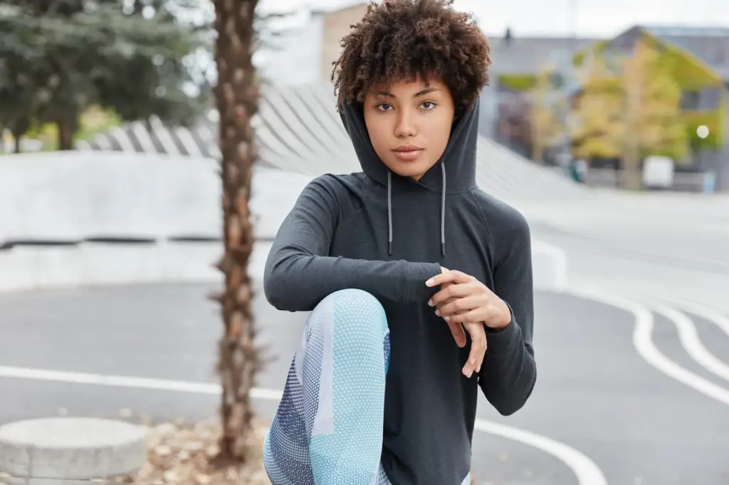
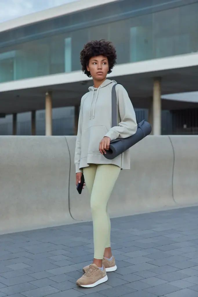
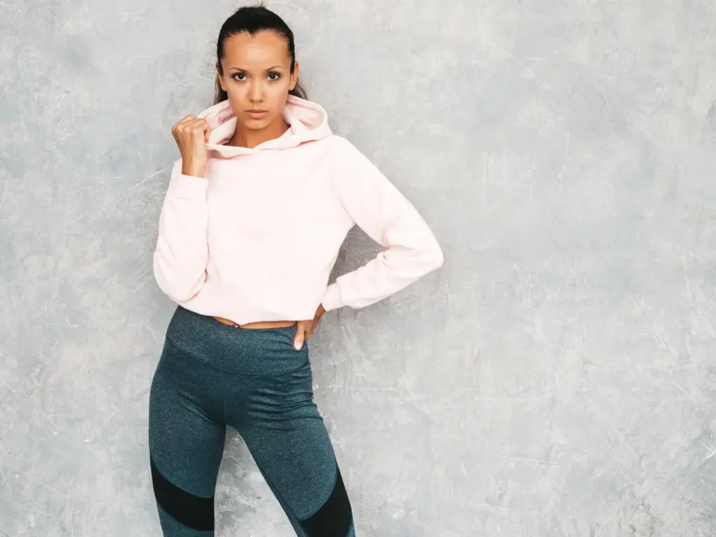
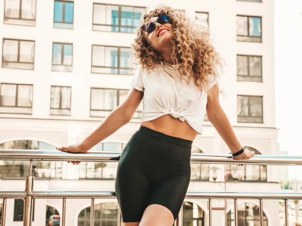
Start with a dependable base of neutrals—think deep charcoal, rich navy, soft stone, warm espresso, cool slate, and crisp ivory—so every bra, tank, and legging can pair without hesitation. A neutral core simplifies decisions, stretches your budget, and instantly supports bolder colors. Consider undertones, fabric texture, and sheen so combinations feel intentional, flattering, and durable across lighting conditions and workout intensity.
Choose Undertone-Smart Neutrals
Match neutrals to your undertone for harmony that looks polished without effort. Cooler complexions usually love slate, graphite, and ink navy, while warmer complexions glow beside espresso, olive-khaki, and creamy stone. Test pieces under natural light, studio LEDs, and smartphone cameras. If one neutral bridges multiple items beautifully, duplicate it across leggings and layers to create an instant anchor you can trust.
Mix Matte, Brushed, and Subtle Sheen
Texture acts like a quiet color. Matte knits read grounded, brushed fabrics feel cozy, and subtle sheen adds energy without demanding attention. Blend two textures within the same neutral to avoid flatness. For example, a brushed charcoal legging with a lightly lustrous graphite bra creates depth. Keep ultra-shiny finishes minimal if you prefer understated looks that still photograph brilliantly after class.
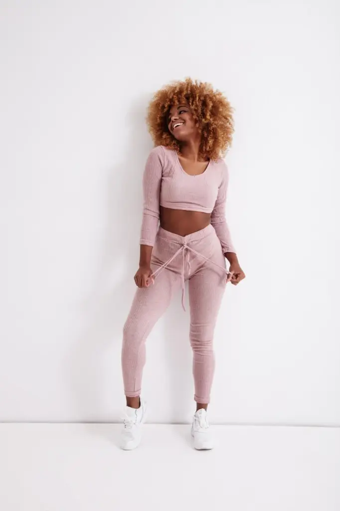
Monochrome Momentum: Tonal Dressing That Always Works
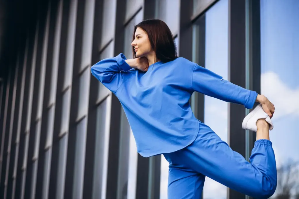
Tonal outfits deliver instant cohesion by stacking light, mid, and dark variations of one hue. The result lengthens lines, looks premium, and simplifies packing for retreats. An all-indigo range or forest-to-fern spectrum keeps interest without chaos. Incorporate subtle texture changes to prevent matchy fatigue, and keep silhouettes varied so repeated colors stay exciting across weeks of practice and recovery days.
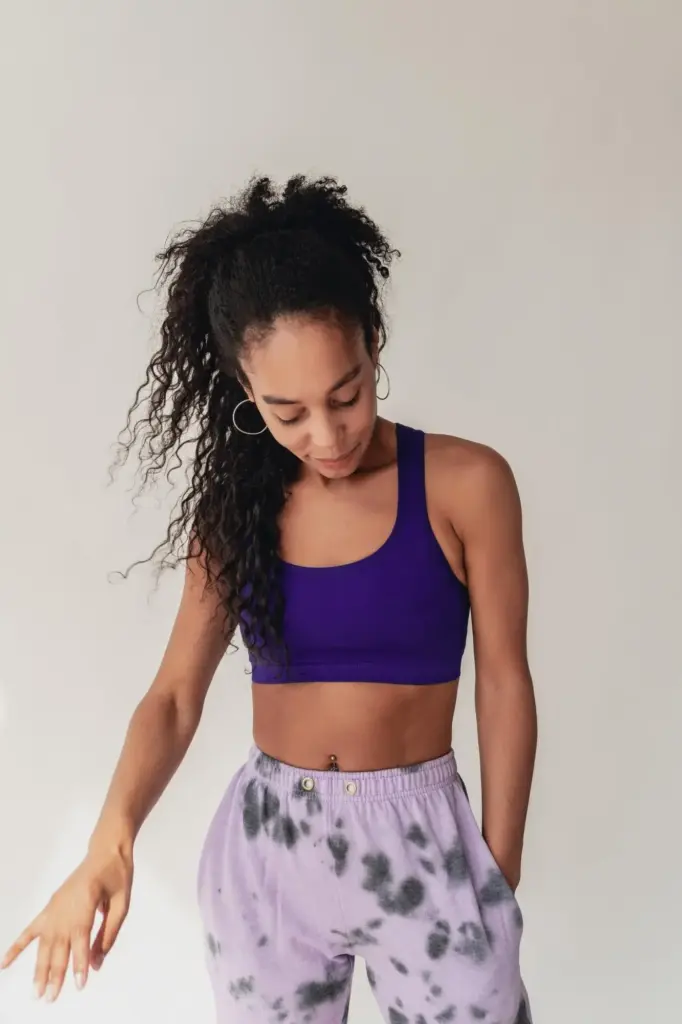
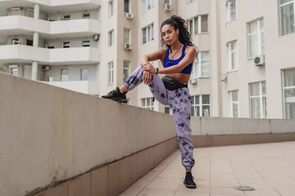
Use the Color Wheel to Add Pops with Purpose
A smart pop color turns basics into bold statements while preserving interchangeability. Use analogous neighbors for flow, complementary opposites for snap, and triadic sets for spirited variety. Keep proportions strategic: one dominant neutral, a supportive secondary, and a small accent. This balance lets printed bras, vivid headbands, or bright wrap jackets plug seamlessly into your existing rotation without chaos.
Pick a Unifying Hue from the Print
Scan your patterned legging for the most repeated color, then echo it in a bra or jacket. This instantly translates visual logic without feeling matchy. If the print is high-contrast, pull a mid-tone from within it for the top to soften transitions. Keep shoes or socks neutral so your chosen echo remains the focal bridge that holds everything together gracefully.
Mind Scale, Spacing, and Density
Large-scale patterns crave broader neutral blocks to breathe, while micro-prints tolerate richer color nearby. Check spacing: crowded motifs can buzz under harsh LEDs. If you love bold graphics, pair them with low-sheen solids in matching undertones to calm reflections. Try movement tests—squats, lunges, folds—to ensure lines land flatteringly and do not distort key shapes that made you choose the piece initially.
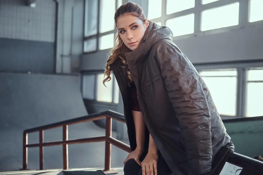
Real-World Factors: Lighting, Season, and Sweat
Colors shift dramatically under studio LEDs, sunrise light, and locker-room fluorescents. Seasonal palettes also change our mood and skin contrast, influencing what feels right. Plan for sweat patterns, transparency checks, and photo moments after class. Test outfits on an active day, not just a mirror glance. Real life provides the best lab for sharpening your interchangeable combinations without regretful purchases.
Test Across Lighting and Cameras
Under cool LEDs, warm olives can appear muddier, while blues sharpen; phone cameras may exaggerate saturation. Step outside, then into the studio, and finally check a quick video mid-flow. If colors drift, adjust with undertone-consistent layers. A cool-navy wrap can rescue an olive set indoors, while a warm-ivory tank brightens everything outside. Trust cross-environment testing over single-room judgments.
Seasonal Swaps That Keep the Capsule Fresh
Rotate deeper jewel tones for autumn and winter, then invite airy pastels or citrus brights when daylight stretches. Keep your neutral core constant so seasonal accents integrate seamlessly. If budgets are tight, update just two pieces—a bra and headband—to shift the vibe. Track which shades spark motivation during dark mornings versus sunny weekends so your wardrobe supports energy rather than drains it.
Plan Around Heat, Effort, and Visibility
High-intensity classes call for sweat-savvy shades and strategic panel placements. Choose darker mid-tones for leggings and reserve light colors for bras under breathable layers. Bend tests protect against transparency surprises. If you film flows or share progress pics, prioritize combinations that resist harsh highlights. Add a matte jacket post-class to calm sheen, maintaining confidence as you transition to errands or brunch.
Finish Strong: Accessories, Proportions, and Personal Flair
{{SECTION_SUBTITLE}}
Coordinate Gear for Seamless Transitions
Pick a mat within your neutral core, then echo its color on a strap or towel edge. Water bottle sleeves, wrist wraps, and hair ties are perfect accent carriers. Keep one accent shade consistent across accessories for continuity as outfits change. This subtle repetition builds a recognizable aesthetic that photographs cohesively, supports branding if you teach, and streamlines pre-class decision time.
Mind Metals, Zippers, and Hardware
Hardware behaves like a color. Choose warm metals—gold, brass, copper—when your palette leans earthy; prefer silver or gunmetal with cool-leaning capsules. Mismatched metals can still work if repeated twice elsewhere to read intentional. If a favorite jacket’s zipper fights your jewelry, swap one element or introduce a bridging piece, like a hair clip, to reestablish coherence without replacing beloved staples.